Modernization through Product Strategy
A complete replatform of a 25-year-old monolith serving 120,000+ people across 80+ facilities.
A modern platform built to scale · One design system across hundreds of pages · Handoffs engineers build from directly
The problem
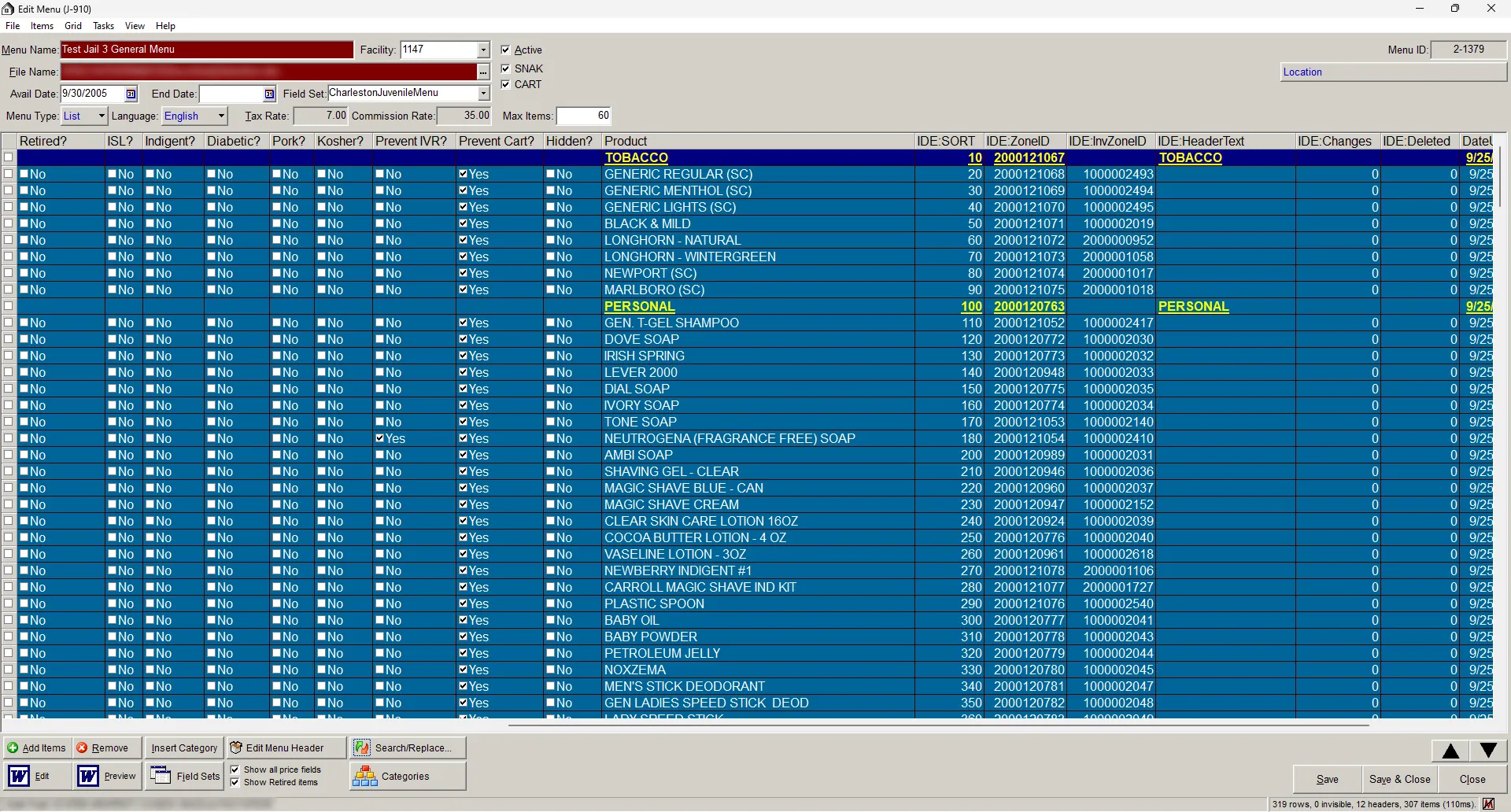
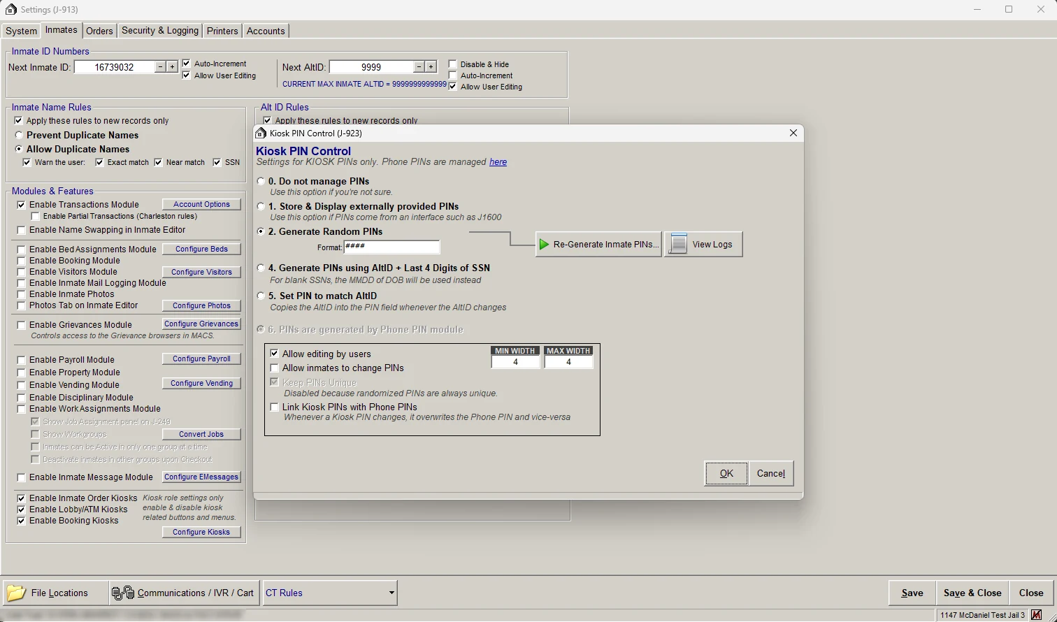
Over 25 years, McDaniel Supply quietly became a software company without ever deciding to. A supply business now serves 120,000+ people across 80+ correctional facilities, all on one aging monolith. It worked, but it couldn't scale, and the experience carried two decades of patches.
Discovery made the rest possible
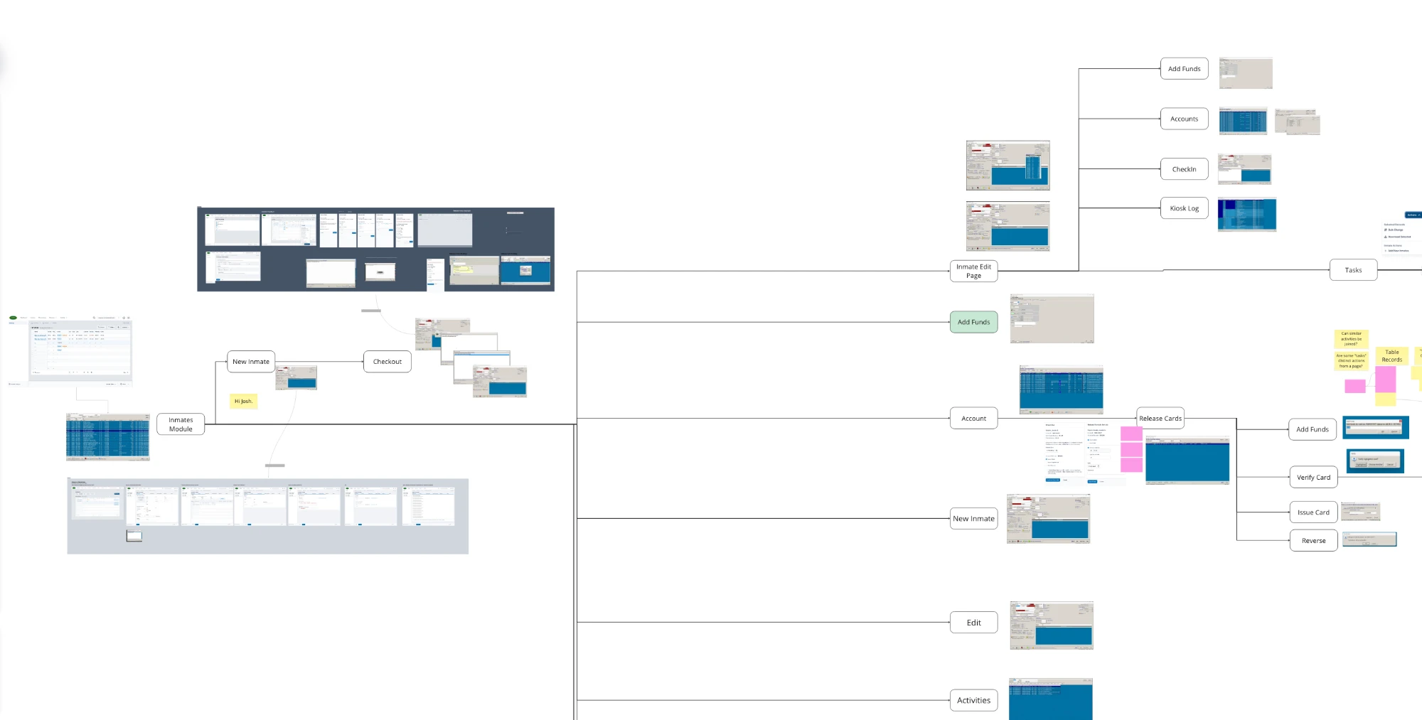
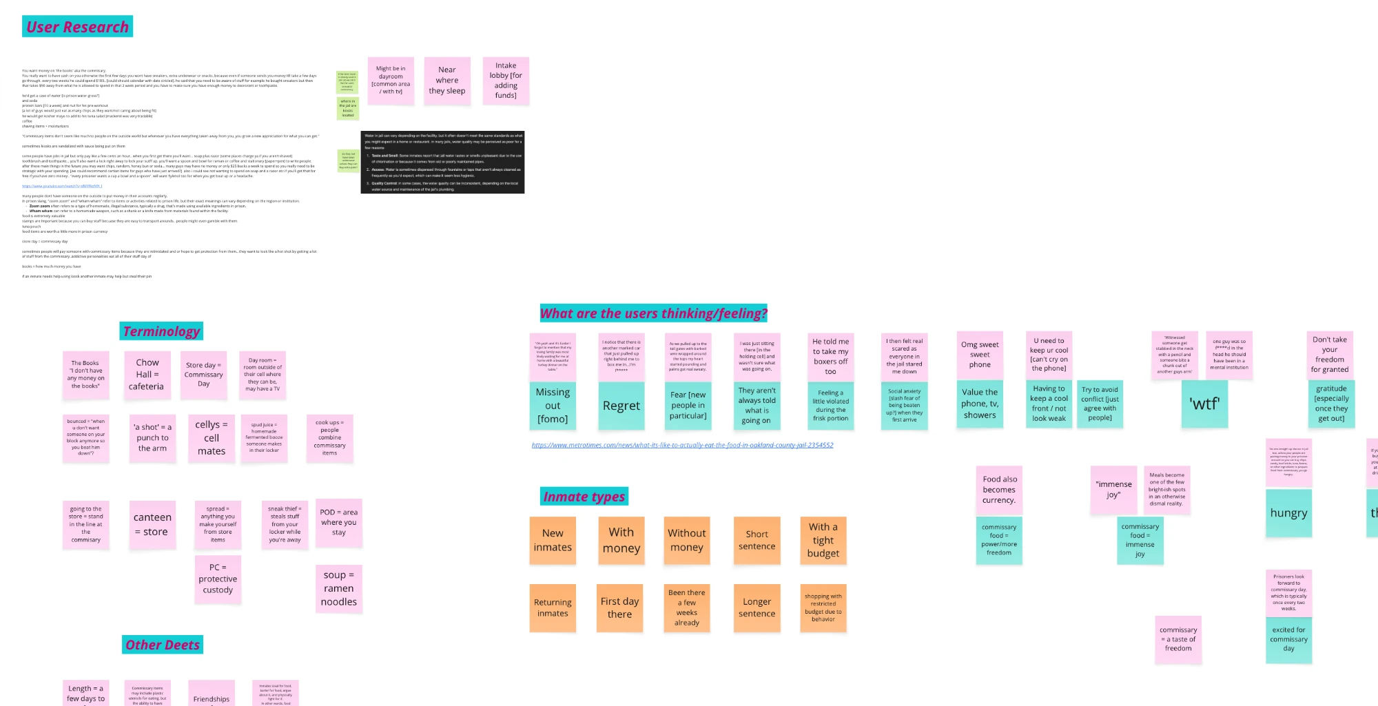
We came in as a partner, not a vendor taking a spec. Discovery mapped how 80+ facilities actually operate, where the monolith was load-bearing, and where there was new value beyond rebuilding what already existed. We also studied the people on the other side of the kiosk: how commissary works inside, the language people use, and how it feels.
AI took on the unglamorous, high-risk part: reading the legacy system, mapping its undocumented workflows, and turning 25 years of behavior into documentation we could design and build against.
That groundwork is why everything after moved fast. The early designs held up, and their patterns became the design system instead of throwaway mockups.
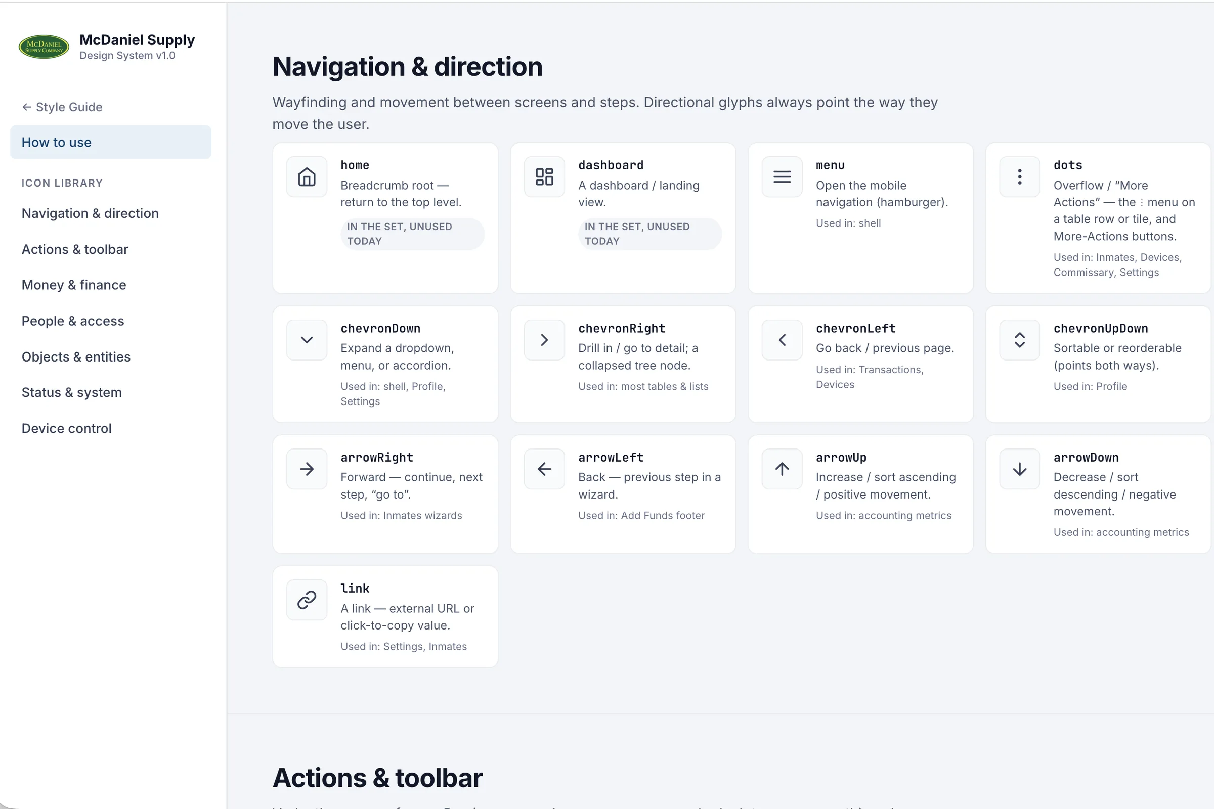
Design system as a repo, not a Figma file
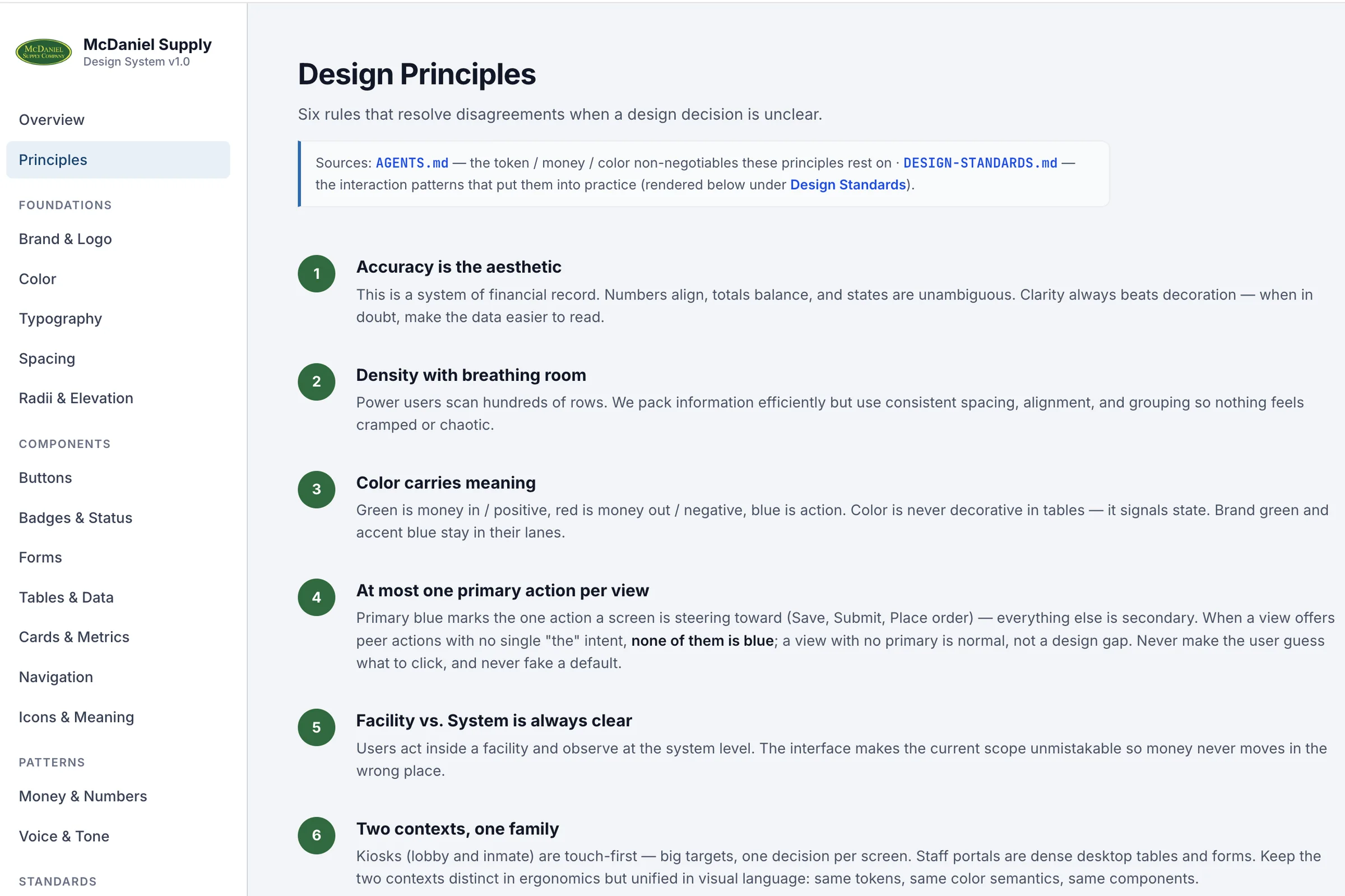
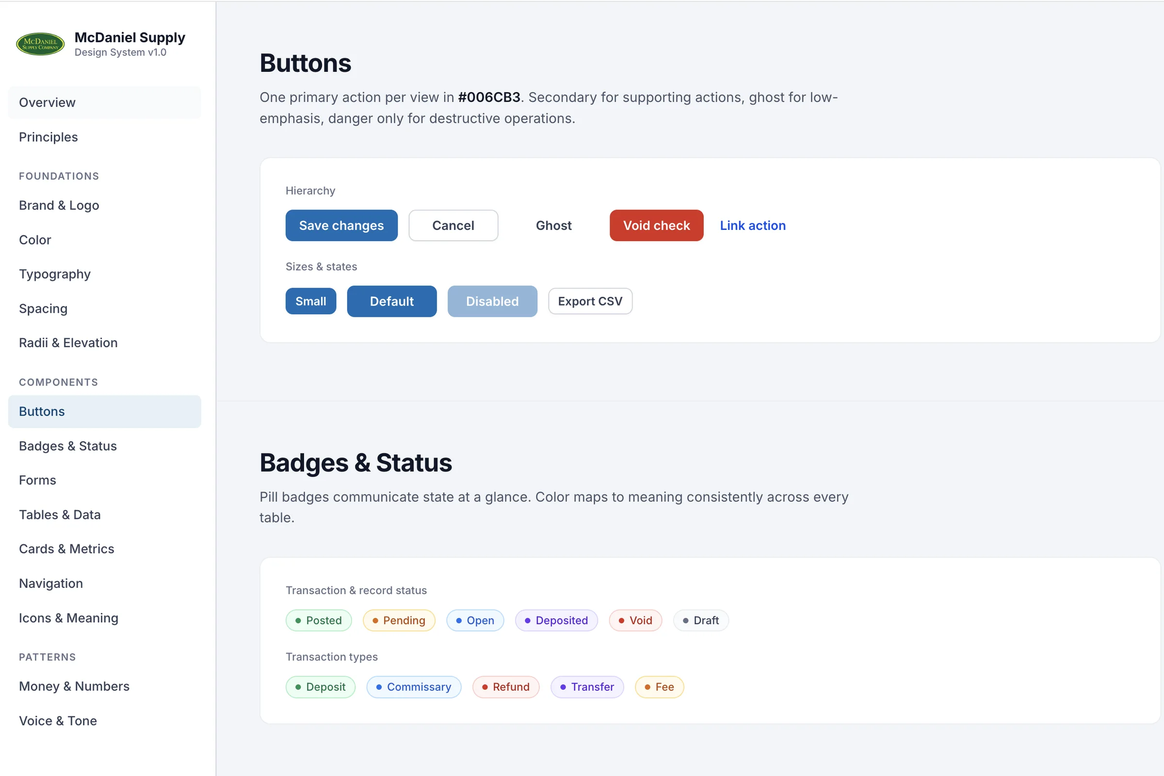
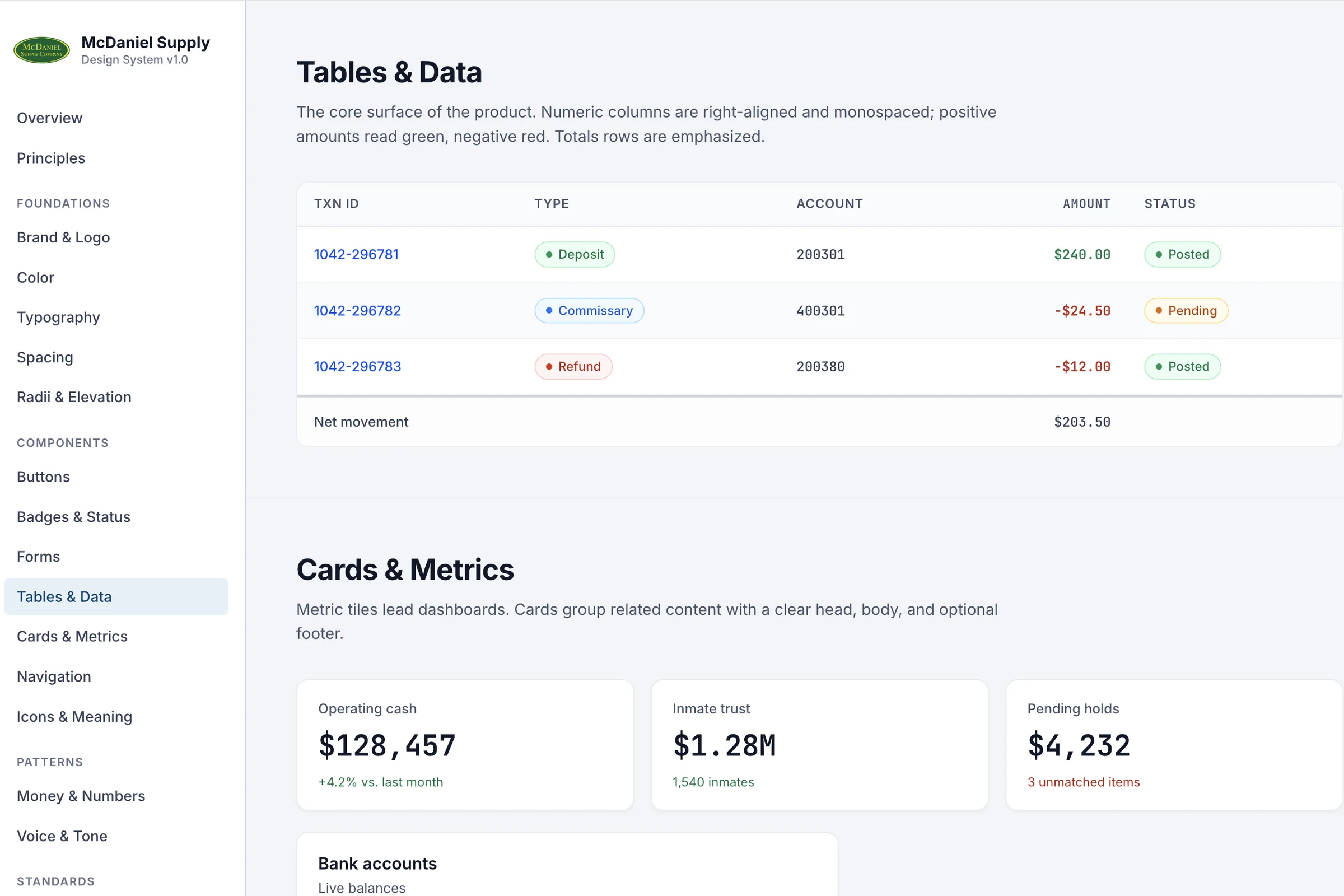
Instead of static mockups, I built a living design repository: tokens for color, type, and spacing, components that only use those tokens, and navigation and data as configuration. It runs in the browser as a real prototype.
Because it's code, it grew as fast as we learned. Six principles settle any unclear design call. Change a token or component, and every screen that uses it follows.
AI as a design partner, with guardrails
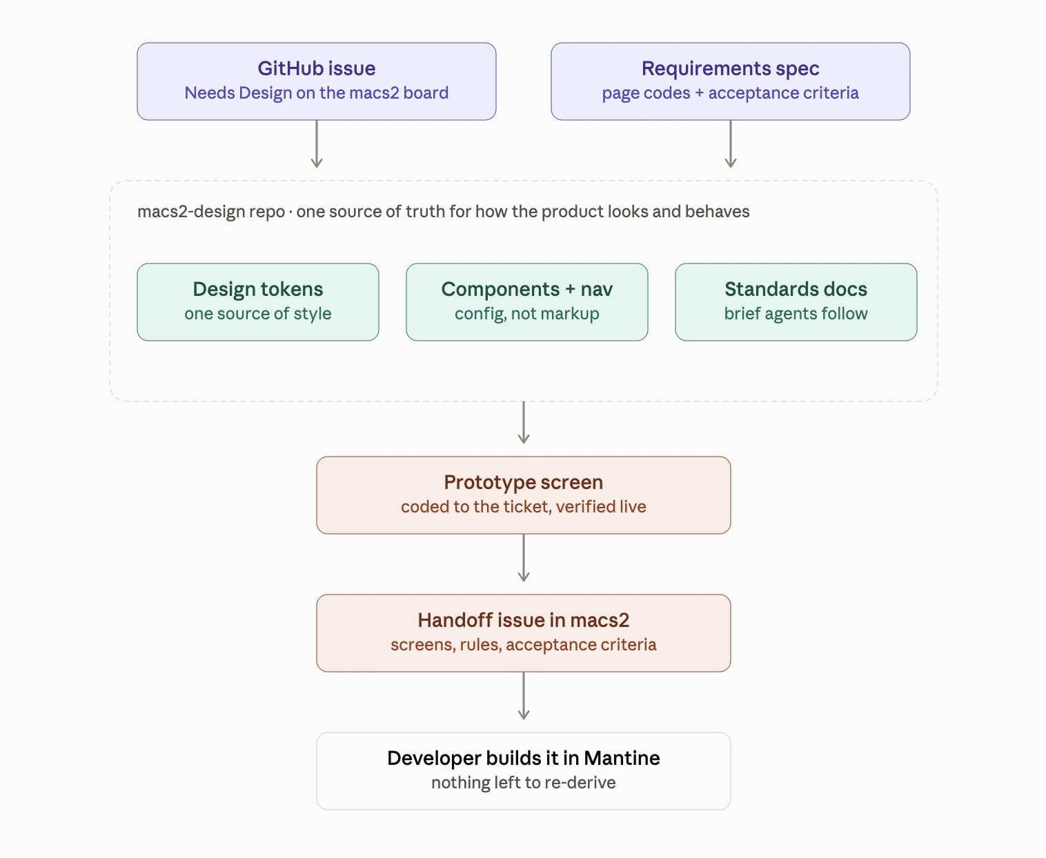
I wrote the design standards as a brief for AI agents, the way you'd onboard a new designer. Every session starts by reading the rules, checking the board, and starting the preview. Then we build together:
- A ticket arrives with dense requirements. The agent reads the spec; I set direction.
- The agent codes the screen against the tokens and checks it live. I review and push back.
- The change is logged, screenshots go on the ticket, and the decision is written down.
Developer-ready handoff
Finished designs ship as self-contained issues in the production repo: screens, interaction rules, and acceptance criteria. Engineers build without re-deriving decisions, and every screen matches because the same rules made all of them.
It also made change cheap. Update a standard once and it carries across hundreds of pages. The system enforces consistency, so nobody has to police it screen by screen.
System and facility screens
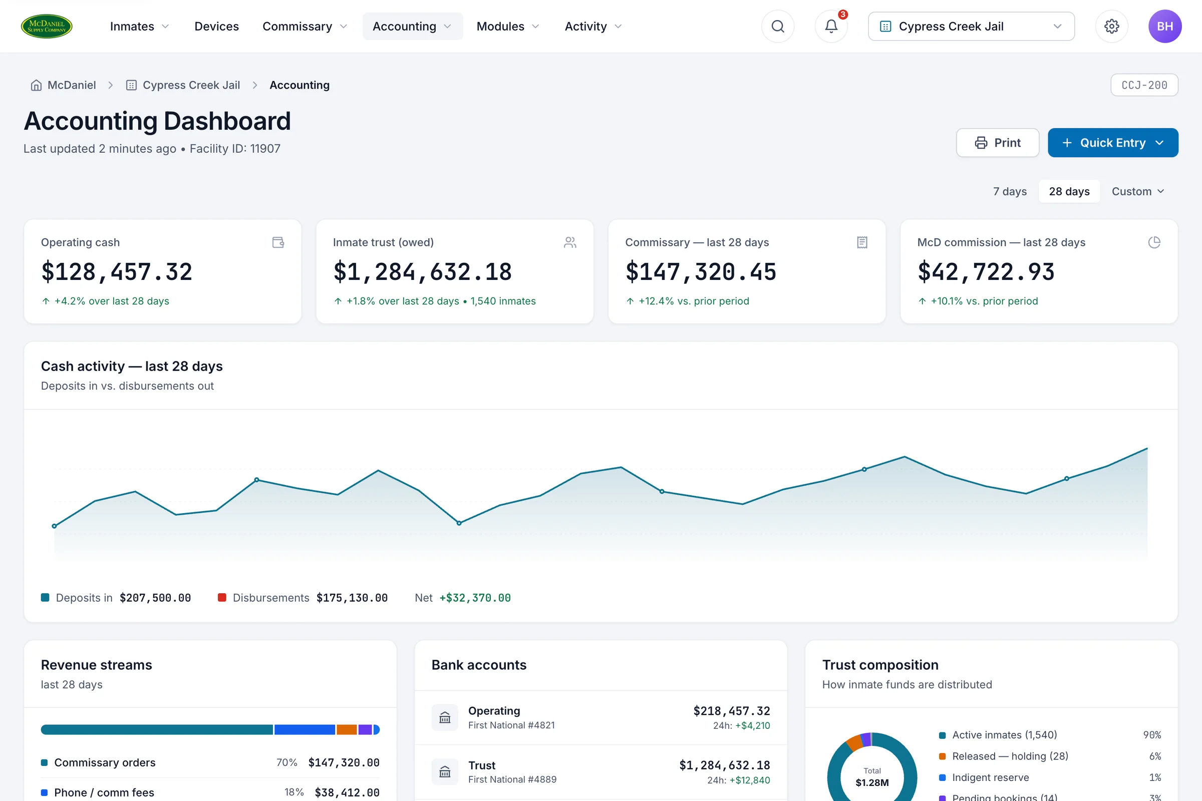
We turned a dated, dense experience into modern staff and facility workflows. People work inside a facility and oversee the whole system, so the interface always makes the current scope obvious.
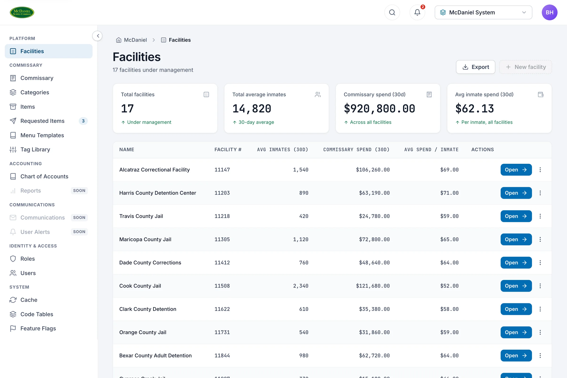
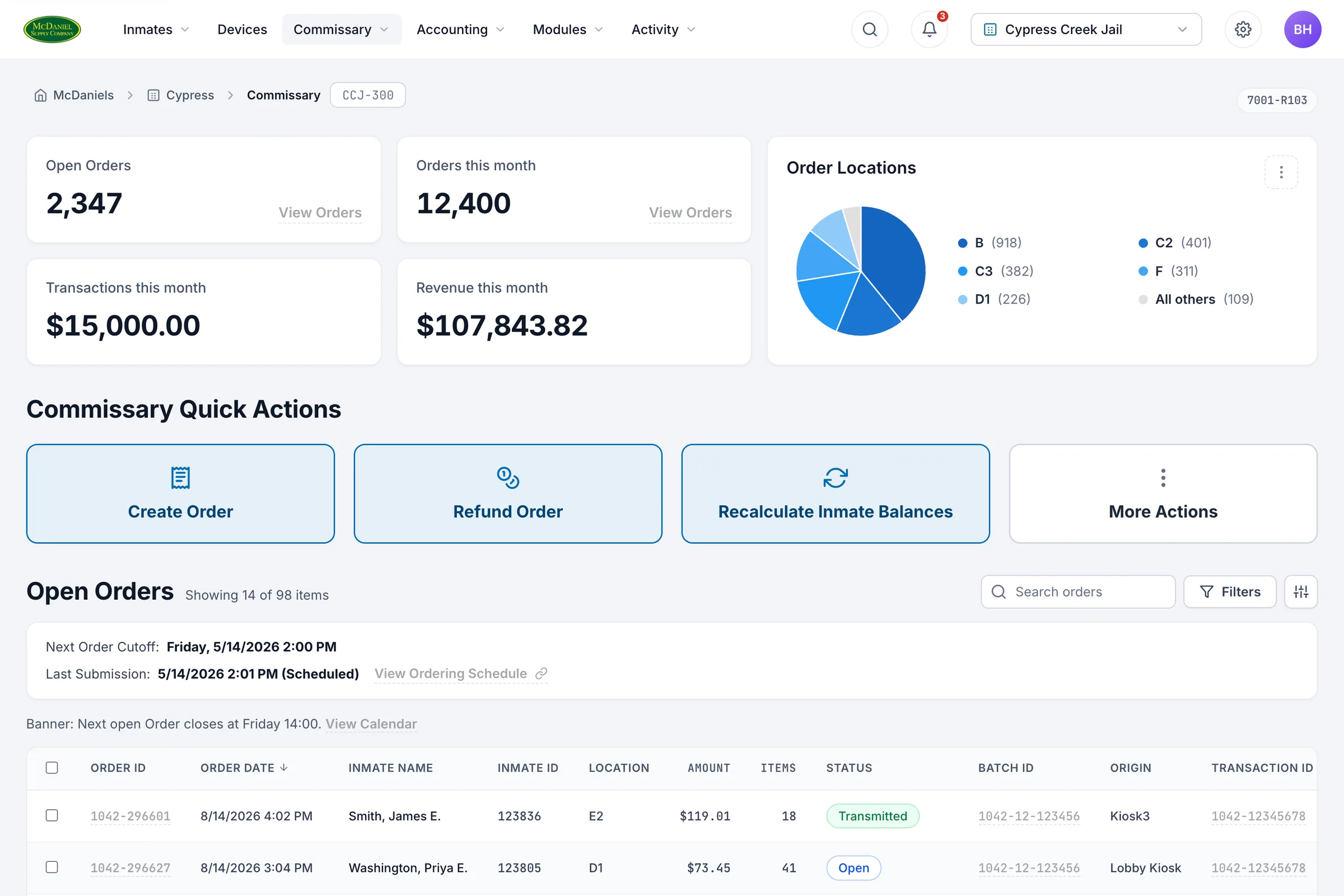
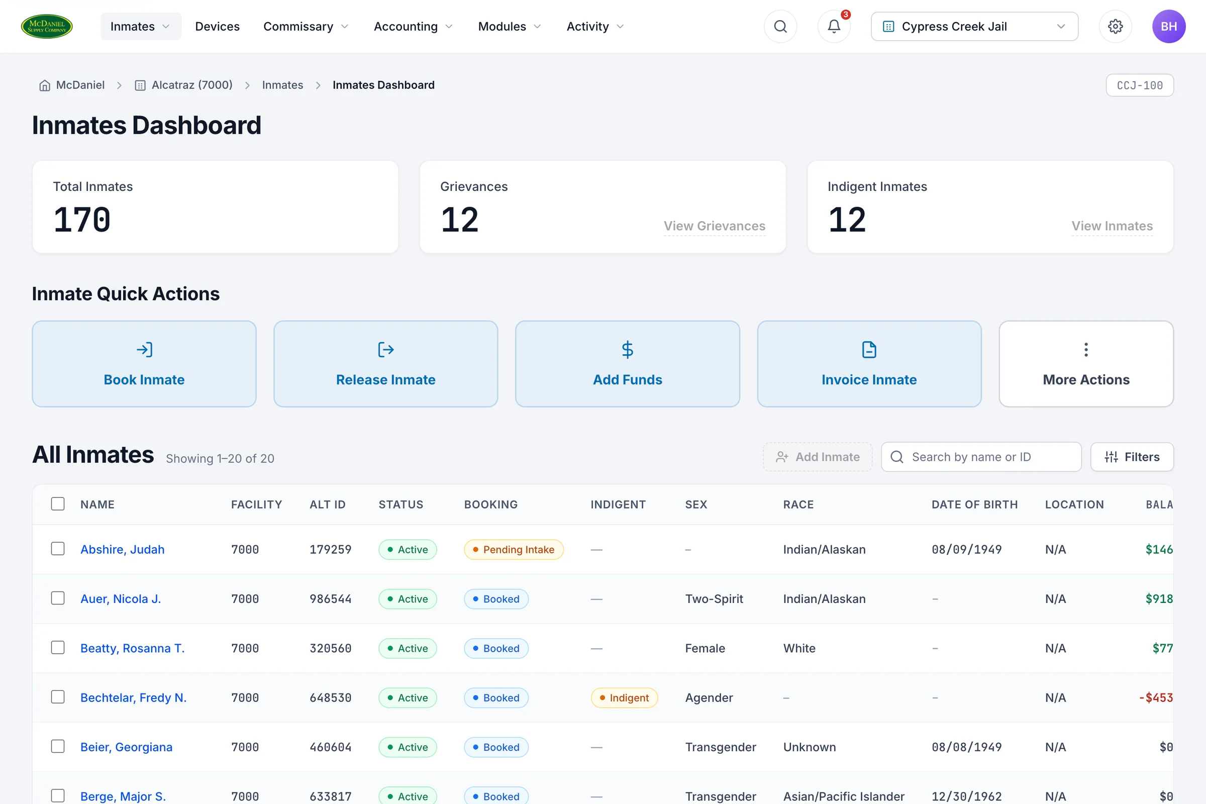
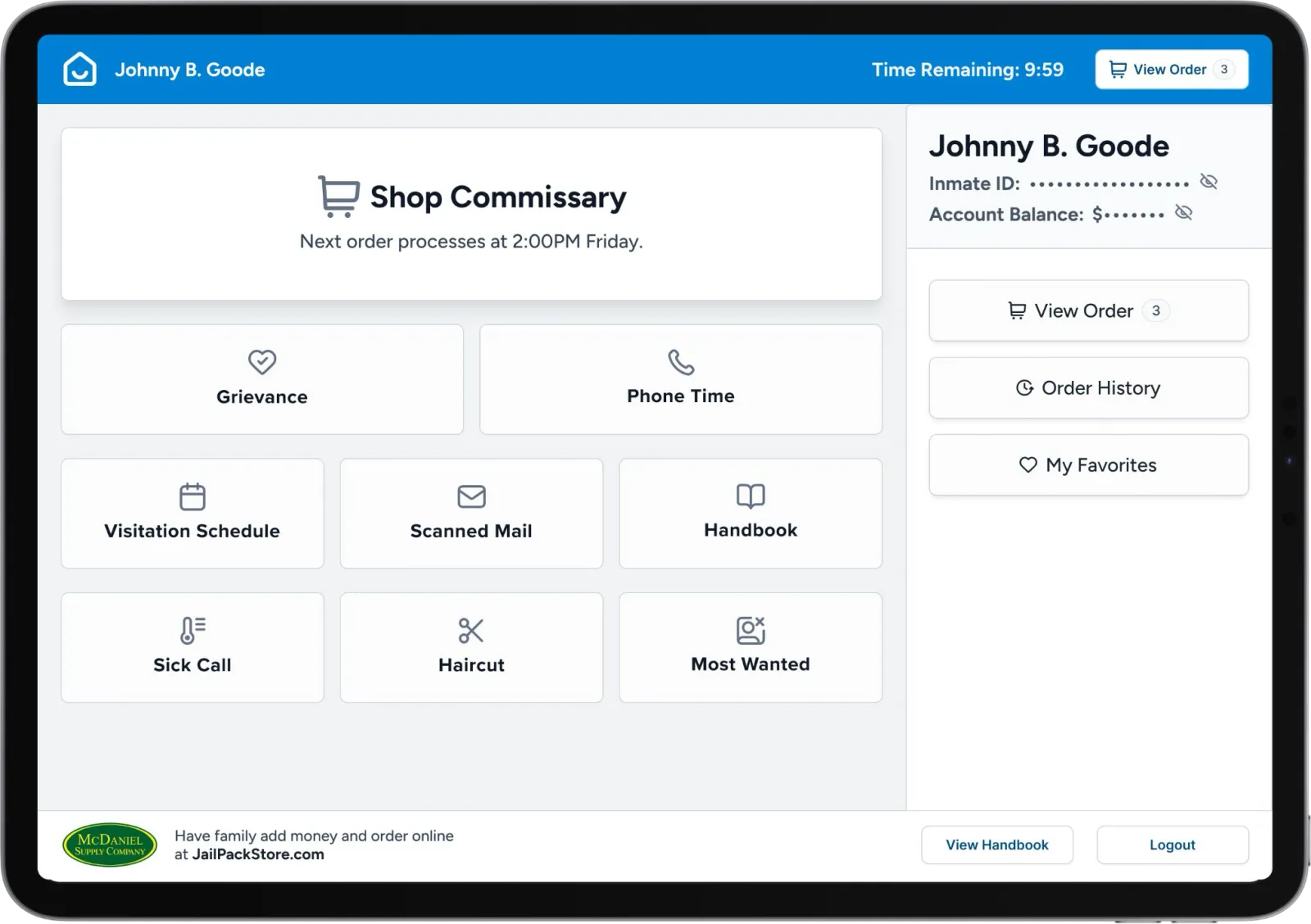
The commissary experience: ordering, grievances, visitation, scheduling in one place.
The result
McDaniel went from a monolith they couldn't grow on to a modern product and codebase built to scale. Discovery surfaced workflows and value the original "just replatform it" brief never anticipated, and the design repo kept pace: a system that evolved quickly, consistency across hundreds of pages, and handoffs engineers could build from directly.
This is modernization as product strategy, not just engineering: understand the business, use AI to de-risk the legacy mess, and ship something better, not just newer.