PlanSource: Design Systems & Enterprise Redesign
Redesign of a B2B2C benefits technology platform resulting in rapid adoption of 91% and 85% customer growth.

Problem & Context:
PlanSource is a B2B2C benefits administration platform. Allowing employees to enroll in benefits, and employers the ability to to manage benefits year round.
The PlanSource platform had grown organically being developer driven without strong product management. Until I joined, there was no design team nor guiding design patterns. The lack of a consistent, modern experience and partner feedback gave us the charter to dig further into this problem.
This was a 3 year project from concept to general availability.
My Role & Team
I led design strategy – integrating human-centricity and business needs. Partnering heavily with product and engineering leeds to define a feasible product strategy. Building a user research understanding through data, cross-functional workshops and user research sessions. I was responsible for early concept design that helped paint the vision, and socializing them internally and with partners.
In addition to myself, the core team included an additional UX Designer, User Researcher, 1 Product Manager, 1 Product Owner, 2 UI developers, and a dedicated development scrum team. My role and this team evolved over time.

Screenshots of the Legacy Admin

Personas
Process
We started by gathering and reviewing accumulated user research, customer and partner feedback. We leveraged this to understand common use cases and usage patterns.
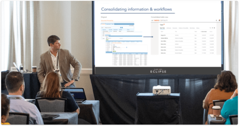
We also need to understand the sheer scope of our Admin experience. While our B2C experience was perhaps 100 views, the B2B experience was 10X in size and complexity. There was also tremendous duplication – in interviewing customer service team members, we discovered as many as 5 different methods to achieve the same change… each team member knowing 2 or 3 tricks they’d learned over the years. Many related functions had been developed over time into separate pages.
Utilizing Data
Data was also incredibly important. We initially started with system usage data, and later invested in tools such as Pendo to better understand customer behaviors.
This helped identify functional areas with an 80/20 rule – focusing our energy on the 20% used by 80% of our customers. Our administrators spent a majority of their time looking for and managing employees. Our initial workflow redesign was Dashboard > Search > Profile > Actions.

Customer Usage

Customer Journey Map
Redesign Principles
We guided the redesign by creating core principles of:
- Holistic & consistent experience: Understanding our customers journey
- 80/20 rule: Understand and address the 20% used by 80% of our customers
- Combine & Consolidate: remove duplication and combine multiple screens
- Inclusive & Accessible: mobile-responsive, accommodate accessibility guidelines WCAG 2.0 AA & best practices
- Support Self-Service: reduce dependence on our in-house service team.
Testing and Validation
This redesign was a shift in mindset for some customers – they traditionally relied on a service-based approach and were hesitant to change. Mitigating customer confusion was important to our internal operations team.
With this in mind, we shared early concepts internally and with partners. Conducting joint user testing of new features revealed 93% positive responses and built confidence.
Customer Workshops
We used our annual conference to present the new HR Experience to 500+ customers. This provided a forum to share our redesign principles and validate directly with leaders in the industry. Using workshops for customers to interact with a prototype and voice feedback.

Customer Workshops
Gravity Design System
A clean, modern and accessible experience
The design system was the backbone of our redesign process. We socialized the benefits to our customers:
- Providing a consistent and expected experience
- Reducing overall customer effort
- Design patterns aligned to our customer’s needs
- Freeing up designers to focus energy on difficult problems
- Iterative and responsive to changes over time

Design System Roadmap

Design System Principles
Roadmap
Design systems are meant to be iterative. We started with a less-is-more approach, only adopting elements that were essential. Creating a roadmap to identify upcoming projects that could shift or add new components to the Gravity design system.
Long-Term Outcomes
In the following years our design team scaled globally. Gravity helped keep us consistent. Eliminating the toilsome basics and allowing us to focus on solving more complex customer problems.
Results
The initial redesign was well received. Design & product developed a strategy to release the MVP and allow customers to utilize both experiences as they learned the beta product.
- 80% of the Administrator’s key activities were consolidated in the first release.
- 91% adoption within the second year of availability.
- 97% of the Administration was redesigned to our Gravity design system.
- Sunset of under-utilized systems, reducing engineering maintenance.
- HCM partnerships grew our platform usage by 85% following the redesign.
“This is awesome and why we signed with you guys! Thank you for all of this!!”
– Jennifer L.
New HR Experience
